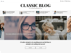
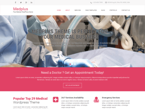
Perfect for news magazine blog technology fashion beauty gadget phone hardware art creative lifestyle modern personal education culture travel viral architecture food recipe medical health game minimal video cryptocurrency science podcast audio government school sport pet animals wildlife fitness military review coffee shop business forum elementor guide agency car photography nature conference rating seo powerful fast top speed test simple mobile first lightweight responsive gutenberg newspaper blogging
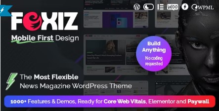
Revolutionize Your News Magazine, Blog with The Impressive Mobile-First Website Builder WordPress Theme.
Experience lightning-fast and lightweight performance with Foxiz – the ultimate solution for mobile and full responsiveness. Ready for core web vitals, ensuring your website is ready to perform at its best.
Foxiz supports Elementor, dark mode, AMP, RTL, and multiple languages, paywall and membership. Fully GDPR compliant, and SEO-friendly schema structure features include site links search box and breadcrumbs bar, Open Graph helping search engines understand your website. The theme is also compatible with popular SEO plugins to enhance your website’s visibility and ranking.
Additionally, The theme is compatible and optimized to work with a wide range of popular WordPress plugins, including Elementor, Contact Form 7, Super Cache, W3 Total Cache, WP-Optimize, Autoptimize, Rank Math SEO, and Yoast SEO and much more.
FRIENDLY CUSTOMER SUPPORT
Our team is proud to have received numerous positive reviews from satisfied buyers on the market. This feedback serves as a testament to our dedication to providing high-quality themes and outstanding customer support.
Our dedicated team is always available to assist with any issues and we strive to ensure that all problems are resolved promptly within 24 hours. With our reliable and responsive support, you can rest assured that we are here to help you every step of the way.
BUILD ANYTHING
Foxiz news, magazine WordPress theme empowers you to build anything you can imagine. With its intuitive drag-and-drop page builder, you can easily create custom layouts and designs that perfectly match your brand and business needs. Plus, It comes with a vast library of pre-built homepages and concepts, so you can quickly get started on your website without having to start from scratch.
With Foxiz, you have full control over every aspect of your website. From the header to the footer, you can customize every element for the desktop, tablet and mobile to reflect your unique style. And with its mobile-first design and responsive layout, your website will look great on any device, ensuring your visitors have the best experience possible.
The theme offers endless possibilities for customization by allowing you to seamlessly combine layouts from different demos. We also regularly add new demos to ensure that you always have access to the latest design trends and features.
ONE CLICK INSTALL DEMOS
One of the standout features of the theme. With just a single click, you can have a professional-looking website up and running in no time.
You don’t need any coding knowledge or technical expertise to get started. The user-friendly interface and intuitive tools make it easy for anyone to create a stunning website that stands out from the crowd.
Foxiz also provides a range of flexible import options, allowing you to import all contents or only specific pages, theme settings, and widgets. This feature is particularly useful if you already have existing data on your site, as you can selectively import only what you need without disrupting your current setup.
FULLY RESPONSIVE, MOBILE-FIRST DESIGN
With nearly 50% of all web traffic coming from mobile devices, we understand the importance of ensuring that your website not only looks great, but functions seamlessly across all devices. The theme is designed with a mobile-first approach and fully responsive, ensuring that your website looks and performs flawlessly on all screens.
We’ve carefully tested our theme on a range of devices, including laptops, tablets, and phones.
- The theme passed Mobile-Friendly Test – by Google.
- Full-screen mobile menu: This feature provides a clear and intuitive menu structure that adapts seamlessly to any screen size
- Mobile menu builder: Build your ideal mobile menu with ease using Ruby Template.
- Live font size adjustment: Improve readability for your visitors, a key feature of newspaper, news magazine and blog websites.
- Responsive settings: customizable options go beyond just desktop devices, offering complete control over the appearance of your website on mobile and tablet devices as well. Allowing you to tailor your website’s design to your preferences and needs.
- Flex entry meta: Allows you to customize your website’s appearance on tablets and mobile devices by providing the option to hide entry meta separately for each device.
- Quick access menu: With Foxiz, you can enable a quick access menu on your website that displays a horizontal scroll bar on mobile and tablet devices.
SMART MOBILE LAYOUT
With Foxiz, you have complete control over the mobile layout of your website’s Elementor blocks, with the ability to switch between list and grid formats for almost every block, regardless of their desktop layout.
FLEX FEATURED IMAGE
Flexibility to customize your featured images to fit any device. This includes the ability to edit the image ratios and width sizes with different values for each device. With this feature, your website’s images will look nice and polished, no matter what device they are being viewed on.
FLEX COLUMNS & SPACING
You have complete control over the layout of your post listings. The theme supports up to 7 columns for post listings on all devices, and you can enable border dividers and adjust spacing between elements to create a polished, professional look. Whether your readers are viewing your site on a desktop, tablet, or mobile device, your post listings will be optimized for maximum readability and visual appeal.
RESPONSIVE HORIZONTAL SCROLL
With Foxiz, your website can provide the best user experience across all devices. One of the features that can enhance mobile and tablet usability is the horizontal scroll bar, which makes it easier for users to navigate through content. With this feature, visitors can simply swipe left or right to view more content, without the need to continuously scroll up and down.
Foxiz provides an intuitive and responsive design that prioritizes user experience on all devices, ensuring that visitors can access your content quickly and easily, no matter what device they are using.
SEO-OPTIMIZED
Don’t let your website’s performance suffer because of poor SEO optimization. Choose Foxiz and take advantage of our fully optimized design. Our theme is built to meet the latest SEO best practices and algorithms, so your website can rank higher and attract more organic traffic.
Developed with the latest SEO best practices in mind, it is fully compatible with a range of SEO plugins such as Yoast SEO, All in One SEO, Rank Math, SEOPress…
Breadcrumbs are an essential feature of a well-structured website. That’s why Foxiz provides support for Breadcrumbs bar. The theme is fully compatible with Yoast SEO, Rank Math SEO Breadcrumb, and Breadcrumb NavXT.
- Passed Google Lighthouse test tools
- Support Open Graph meta tags
- Meets the latest SEO standards and includes microdata markup for article and review posts.
- provides support for Google SERP and Sitelinks, allowing for improved search engine visibility. You can also add SEO information directly through the Theme Panels, ensuring your website meets SEO standards.
More Extra Features:
- Unlimited sidebars
- Cross-Browser Compatibility: Chrome, Safari, FireFox, Edge, Opera
- Comes with auto YouTube, Dailymotion, and Vimeo featured image downloaders. All you need to do is paste the URL, and the theme will automatically download the featured image for your post.
- Built-in review system: stars and score, schema markup supported
- Automatically calculate reading time for posts.
- Create custom entry meta
- Reading progress bar
- Sponsored posts
- Svg uploader
- Weather widget
- Post tagline
- Preview video: play a short preview video when hovering on featured image.
- Social followers counter
- Integrated with Instagram, Facebook, Twitter, Pinterest, Linkedin, Telegram…
- Instagram images grid
- Create custom social profiles
- Built with HTML5 and CSS3
- Youtube and vimeo video playlist
- Floating video iframe
- Blocks and layout designs
- Blog index template builder
- Various category headers
- Category page settings
- Contact form 7 supported
- Address widget
- login form popup
- Custom default login page layout
- More menu section
- Notification icon: display bookmarks and new release articles
- No coding required
- Single inline mailchimp form
- Smart sticky menu
- Sticky sidebars
- Covid-19 statistics cases data
- According tab
- Single post highlights, key points
- And much more…


